
What you’ll find here
A long-ish career that spans many roles, industries and sectors = a lot of material to work with.
But no one wants to read that novel. Not even me, really. So, these are brief stories about some of the work I’ve done since 2012.
A bunch of DocuSign — Perspective, work and impact on career ladders/hiring, design maturity, and enterprise-level facilitation.
Splash of Rush — While I wouldn’t say I did design work, this is a design-sh stroy about virtual care delivery.
Sprinkle of Avanade — about rapidly scaling a team to over 100 people in a design operations role.
Spoonful of MorningStar — how I approach designing services (Accessible Investing) and products (Modern Portfolio Theory), yes, including some UX deliverables I created.
Virtual First Primary Care
One of the biggest problems in American healthcare (besides cost) is the shortage of providers. From physicians to nurses to mental health professionals, it’s getting dire at every step — from finding a provider when you need one, to being able to make an appointment in a reasonable timeframe, to getting the treatment you need near where you live.
One of the most promising solutions is virtual care. It’s efficient, it keeps sick people out of public spaces, it addresses localized provider shortages, and it’s good business for healthcare — better access for more patients also means more patients seen and paying (let’s be honest, it is a business).
There’s at least one big barrier: A majority of patients still believe they have to see their doctor in person to get good care, even if it’s inconvenient and difficult for the simplest of conditions, like ear infections or dermatitis.
The truth is, about 80% of visits — particularly for common conditions treated by primary care, the entry point for all care in any health system — can easily be virtual.
No one needs to work that hard to get care or see patients.
Enter, virtual first primary care:
2-3 days virtual, 2 days in-person appointments
Primary care plus support for chronic conditions, like diabetes or obesity
Staffed to address more holistic patient needs than typical PCP clinics
Shorter appointments —> higher availability
Use of patient-facing technology to streamline every visit
In practice, this supports:
Faster, more complete understanding by staff of what’s happening for patients, achieved by standards for consistency that support a cross-disciplinary care team
Chronic conditions treated in one clinic instead of through several specialist referrals, unlocked by having pharmacists, social workers, and eventually other specialists like mental health providers on staff.
Streamlined appointments focused on time with a patient, achieved by using patient-facing tech for tasks like check in, reason for visit, and check out
What I did
I had the benefit of working with a physician who was running a pilot of this model, so we were scaling and enhancing an existing operational model.
These included maximizing the use of electronic forms and patient onboarding so that 15-minute appointments could be spent providing care, not typing; SLAs in place for 4-hour or less response time to patient messaging; more modern clinics that had the ability to support patient-friendly technology; and better technology support for patients whose visits were mostly virtual.
So, in a way, designing this as a scalable service was pretty easy. In a whole other way, I had to work with some pretty squirrelly technology — Epic, the relative standard for electronic health records and its patient-facing view, MyChart.
I designed a prototype to share with the full team after running an ideation workshop. (Screen shot below. More could be shared in an interview.)
I socialized it with everyone who needed to buy in, including the IT team. When I departed they were building out the operational model and technical requirements.
How I did it
So many people have experience with the weirdness of MyChart that I won’t describe it all (also it would be a novel), but let me just say this: most of its weirdness is tied to operational inconsistency across provider practices.
Such a mouthful, so in plain English: doctors who set up their practices want to do it their way, and system IT teams typically bend over backwards creating customizations for them. This creates a big mess when you start looking to improve the entire system. And then there’s Epic, which is even weirder.
I had to learn a lot about both systems to design this as a scalable service. I also had to lean pretty hard on the technology team responsible for the current state; I’m reasonably certain they didn’t know why they should work with me at all, when to them, this looked like just another clinic.
Conclusion
Healthcare and its delivery in the United States is one of the most inhumane systems I have ever come across, which may seem an odd conclusion when this work was setting out to improve things for both providers and patients and has a pretty decent model to achieve that goal, at least on a small scale.
What I mean is this: for a system that is supposed to be about providing human beings with care provided by other human beings, it is not built to support either set of human beings.
I visualize it as the monolith in 2001, but bigger, standing between both provider and patient as a behemoth set of barriers, including
linear protocols for diagnosing patients based on symptoms that don’t leave room for listening compassionately and treating holistically, making providers seem like automatons speaking a different language
a business model that incentivizes quantity when its users (patients) need quality, while providers may well prefer to focus on giving higher quality care to fewer patients
regulatory requirements that are well-intentioned but create a bureaucratic maze worthy of Kafka, and
extractive, exclusive health insurance (in the US)
financial barriers for patients, who bear the cost of a system that is so expensive to run
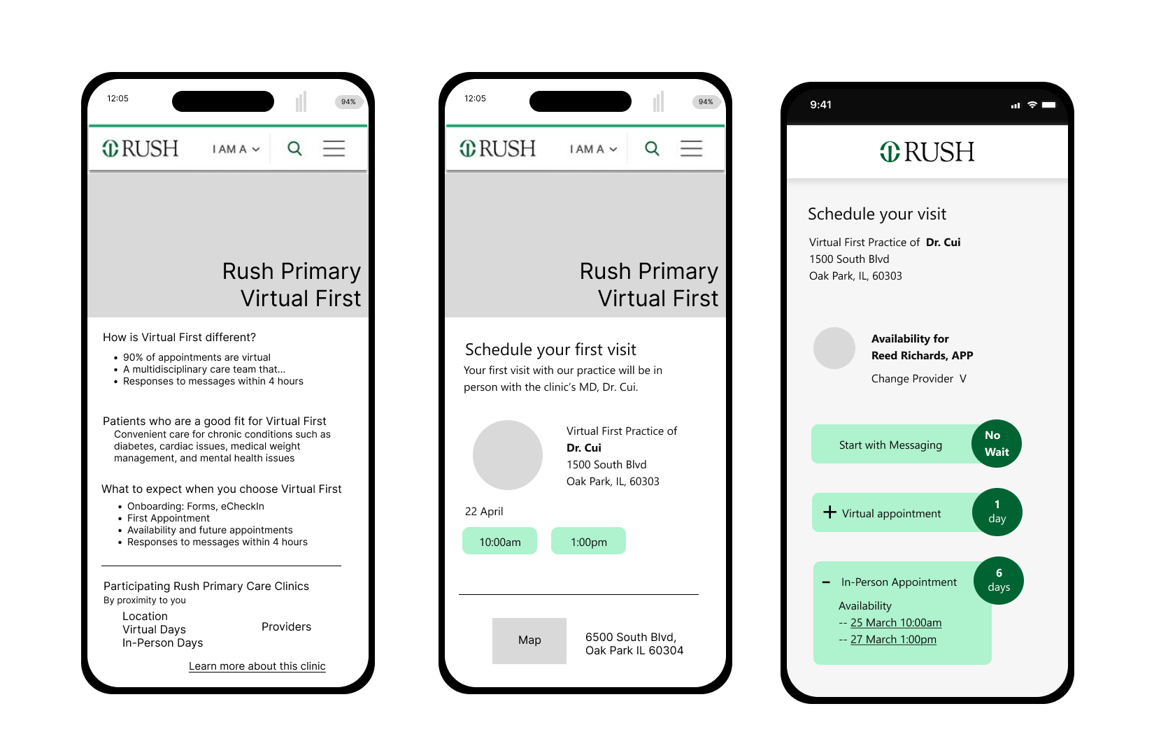
Three phone screen sketches of the public-facing content about a Virtual First Primary Care Clinic.
Design maturity FTW
Wherever I go, I try to leave things better than I found them.
Simple to say, harder to do, and sometimes even harder to recognize.
I use time-tested methods of strategy and design. I apply it to how I set up and run teams, develop partnerships, and see impact.
Whoa! obvious Problems
When I was asked to take on a team of nearly 20 designers and managers at DocuSign after a tsunami of executive and leadership departures, I started out like I usually do: listening, watching, and talking to people.
I saw
a set of overwhelmed managers, lead designers who felt stifled, and mid-level designers craving mentorship
three separate teams of designers who almost never spoke working on “editions” of the same SaaS enterprise product
a sub-par user experience that designers felt they were having no impact on
a leadership team that believed design was there to execute on a vision, but the vision couldn’t be developed because of…
dangling product strategy questions about whether or not we’d integrate with the company’s flagship product, which stalled vision and design work
I started by mapping out the process and all of the red flags I saw in it.
The Diagnosis
We had
a product that wasn’t so much a product, more a disparate, disjointed, kinda-sorta “workflow” thing
a process that was simply not friendly to design or designers
product managers incentivized to ship but not focus on quality
engineers working on an aging tech stack — minimal changes only, please and thank you
a high percentage of churning customers who would declare on departure that “this isn’t a DocuSign product”
I drew out a huge whiteboard on Miro with the process, my goals for improvement, and a big space in between for ideas on how to get there. I filled it, then deleted half the post-its right before I talked to my team to see how they responded and what they thought.
Changes I made
In the changes I decided to make first, I prioritized the team’s health and actions I thought would have a high impact on motivation because.
Here’s what I was able to do in the time I had (6 months before another re-org):
I moved designers from a product-centric model to a core jobs to be done model so that everyone would learn about similar functionality across editions without breaking the flow of work.
I asked lead designers to be responsible for a job to be done category, supporting product quality overall by leading critique and mentoring designers with a focus on de-duplicating and bringing better continuity in. This gave them a differentiated role from senior designers.
I also asked leads to use what they learned about inconsistency in conversations with engineering leaders to start bringing the idea of streamlining the user experience and product, which helped them start seeing better impact.
Managers were moved away from managing design work to managing relationships with product so that we could mature the conversations, which helped us get more involved in up-front planning — when we could propose research and testing.
I started escalating the product strategy issues to senior leadership in product experience and in forums where I had a chance to ask questions about it, which helped surface the need for clear decision making at the executive level.
The changes started to take hold and we started moving forward in more productive ways. Had I stayed in that role, I would have kept going with my plan, evolving it as I saw impact and need.
Best. Workshop. Ever.
About 3 months after running an effective priority- and roadmap-combining workshop for two European teams, word got around, and I was asked to do another workshop for our Growth team.
At first it sounded rote and normal: a workshop about alignment and priority setting, with roadmap items emerging, but then... I learned there would be over 100 people, it would be in person, and the goals were ambitious for a DocuSign get-together.
What I did
So… I’m gonna need a bigger boat. I got to work on:
Designing eight hours of in-person ideation workshops spanning 2 days for 170 employees across all major functions — marketing, design, content, engineering, growth, and their leadership
Recruiting and prepping nine facilitators and a photographer to facilitate 30-person breakouts
Supporting the selection and organization of a venue that would hold all of these people, work for the activities I designed, and purchase all the supplies (have you ever bought and transported 200 Sharpies at once?)
How’d It Go?
The space was extremely… hotel beige. People started out ambivalent, not knowing what to expect. Pretty soon they were shoulder deep in (compostable) Post-its, making new connections, and building partnerships that wouldn’t have otherwise existed.


All the activities we did over two days.
Sounds fun, but what were the outcomes?
Most importantly for where DocuSign was at, I was able to
Facilitate conversations that built unified momentum for relevant business change that will continue for at least two years
Galvanize our product-led growth teams to action, exploring shared ideas for reaching ambitious goals that went into their OKRs
Help Growth executives build a successful case for the CEO to include the ideas we developed in the product team’s roadmaps
Make the Product Experience team look great at a moment when the products were under a lot of (warranted) experiential scrutiny
The most gratifying outcome was what people said to me afterward. I was approached by multiple people, including sponsoring execs, who told me that was the most effective, engaging gathering they’d ever attended for work.
I’d be happy to chat more about how I chose the activities I did, how I designed the interactions, and how I kept the energy up for two whole days in a beige ballroom. This piece would be much too long if I explained all that here!
Lastly, here’s an update from a design leader about a week after our workshop:

Accessible investing
There is almost no subject more thought about and less discussed than money.
One piece of the money space that seems to make people the most angry and frightened — often to the point of avoiding it altogether — is investing. But unless we are independently wealthy, all of us have to do it to keep pace with the rate of inflation — at least in the United States, if we ever want to stop working.
And yet, in our society, it’s not okay to admit you don’t understand financial instruments or the stock market or how 401(k)s work. Not learning or avoiding it leaves millions of people in a combined state of ignorance and unpreparedness.
What does this mean? This means that we’re about to confront a retirement crisis in the US. (Spoiler: It’s already happening.)
I was hired at Morningstar to help change that.
My metric for success was simple: raise the national average rate of saving for retirement by at least 1%.
I mean, what’s the point of tiny goals?
Investing speak ahead:
For people who want to know if I know what I’m talking about — Morningstar wanted to use Goals-Based Investing, where you set a time horizon, an amount of money you’ll need for drawdown over time, and you are delivered options for a model portfolio that matches your risk tolerance. Then you move your money in, add to the account over time, and voila! Pretty soon you are okay for retirement or other goals.
Morningstar was also behind the curve on what people called “robo” tools, a trend that didn’t exactly work out that well in the end for anyone.
(Let me warn you now: this story does not end happily, and that still occasionally brings a tear to my eye. In fact, when the product manager broke it to me we both cried because we were so committed to solving this problem.)
So, what did I do about it?
Defining lots of moving parts
My earliest collaborators were a lead researcher and a behavioral economist. We looked at models we could use and how to translate them into a combination of education and product, we thought about what kind of support a service like this might need from real people, we went into homes to talk to people, and then we talked to more people.
When it was time to add some pixels to the mix, we chose a few psychology theories and Morningstar methodologies to design an onboarding flow that was mobile first. We talked to more people, testing the heck out of it until we got to a Tinder-like flow for choosing financial goals and a conversational onboarding flow.
We also had to think about where people would be putting their money, which really meant what we were going to do with Morningstar IP and technology. We chose our goals-based model portfolio creation tool, talked to the team that owned it, and started integrating that into the product. That was pretty hard, from a design perspective, to do on a phone. We thought most people would probably move to a larger screen for that part but still designed for a small one.
We also had to figure out how transactions would run once people opened an account. We chose a custodian and set it up to run through Morningstar’s existing registered investment advisory (RIA). Custodians handle actual trades, deposits or withdrawals when people invest in a new portfolio or it needs to be rebalanced. We started integrating their tech with ours.
Just as it was all coming together, when we were ready to pull all of that together to execute on an MVP, the company pulled the plug.
For those of you interested in the evolving design-y aspects of this work, including what I created… well, honestly, I tried but because it’s a service, not a product, it just doesn’t lend itself to a sensible set of visual deliverables... there’s just way too much work for a blog post to do it justice.
I am more than happy to share it in a conversation.